Color Series: Master Bedroom

Hi everyone and welcome to the final design in this color series! Today I’ve used Benjamin Moore’s STAINED GLASS. It’s a blue paint hinted with green leading me to create a cozy space fit for the Winter mountains. Something about this color and the Holidays upon us that had me picturing a luxury spa resort in the mountain. The canopy bed is dramatic, while the wood toned nightstands are a soft touch. Don’t forget that fun cozy sheepskin bench. This one may be a little out there, but it’s different! Let me know what you think! And as always – thanks for stopping by. XO, G

Benjamin Moore Stained Glass & Cloud WhiteCrate & Barrel Canopy BedC&B NightstandsC&B BenchWayfair Table LampsWayfair ArtworkPottery Barn Rattan Art PiecePottery Barn RugBrass Trinket BoxBrass Picture Frame

*I do not own the rights to the individual images above. *Design uniquely created by me, Greta Templin.
Color Series: Girls Room

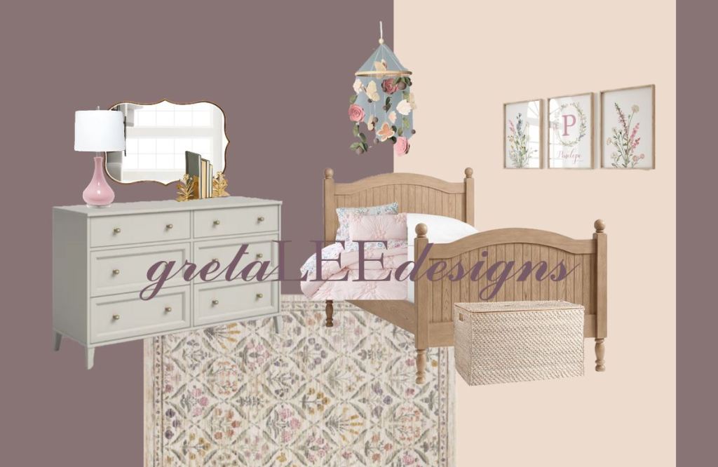
Pinks & Purples, what could be better?! Today’s color series design is featuring Benjamin Moore’s 2025 Color of the Year – Cinnamon Slate! I’ve also included Tissue Pink, the perfect accent color to lighten the moody purple undertone color. These two colors together led me to florals and lots of pinks. Most of these pieces could be styled in a nursery and keep with your child’s room for years to come. It’s sweet, yet sophisticated. Just what sugar & spice is all about! Take a peak below and let me know what you think! Happy Styling – XO, G

Pottery Barn Kids BedPBK Butterfly SheetsPBK Comforter & ShamsPBK Storage TrunkEtsy Wall ArtEtsy Floral MobileRifle Paper Co RugWayfair DresserWayfair MirrorWayfair LampWayfair Floral BookendsPaint Colors

*I do not own the rights to the individual images above. *Design uniquely created by me, Greta Templin.
Color Series: Living Room

Welcome to a new 4 week design series! These next designs are inspired by Benjamin Moore’s 2025 Color Trends. First up is Rosepine and Paris Rain! I was hoping there would be a Green color palette suitable for a relaxing living room. This color always seems to draw me back to nature, letting a grounding energy come through. The furniture pieces are cozy and neutral, with pops of wood tones in the end and coffee tables. Remember to always add in fun elements to your space with accent pieces. A textured rug, fun pillows, and art work that speaks to you. I hope this color palette and design brought you inspiration! As always, thanks for stopping by and see you next week 🙂 XO, G

Color TrendsCrate and Barrel CouchPottery Barn Accent ChairNathan James Coffee TableFurniture Mart End TableTarget Floor LampTarget Table LampTarget PillowsWayfair RugWest Elm Artwork

*I do not own the rights to any of the individual photos. *Design created uniquely by me, Greta Templin.

Kitchens and Living

The heart of almost every home is the kitchen! You’re in there for at least three meals of the day, and if you think about it, whenever there is a gathering of people, there has to be food. For this reason, it’s a no brainer why every modern floorplan today leans towards an open concept – grabbing a snack at the large kitchen island and being able to sit close by on your couch. My apartment is already like that and I can’t imagine living any other way! When it comes to design though, the overall aesthetic of your homes floor, walls and cabinetry can really make a difference as to how you design your living spaces. The kitchen typically creates the foundation for a home’s overall feel and style, so today I’m bringing a design totally opposite from my current modern, bright and clean lined apartment kitchen and living room.

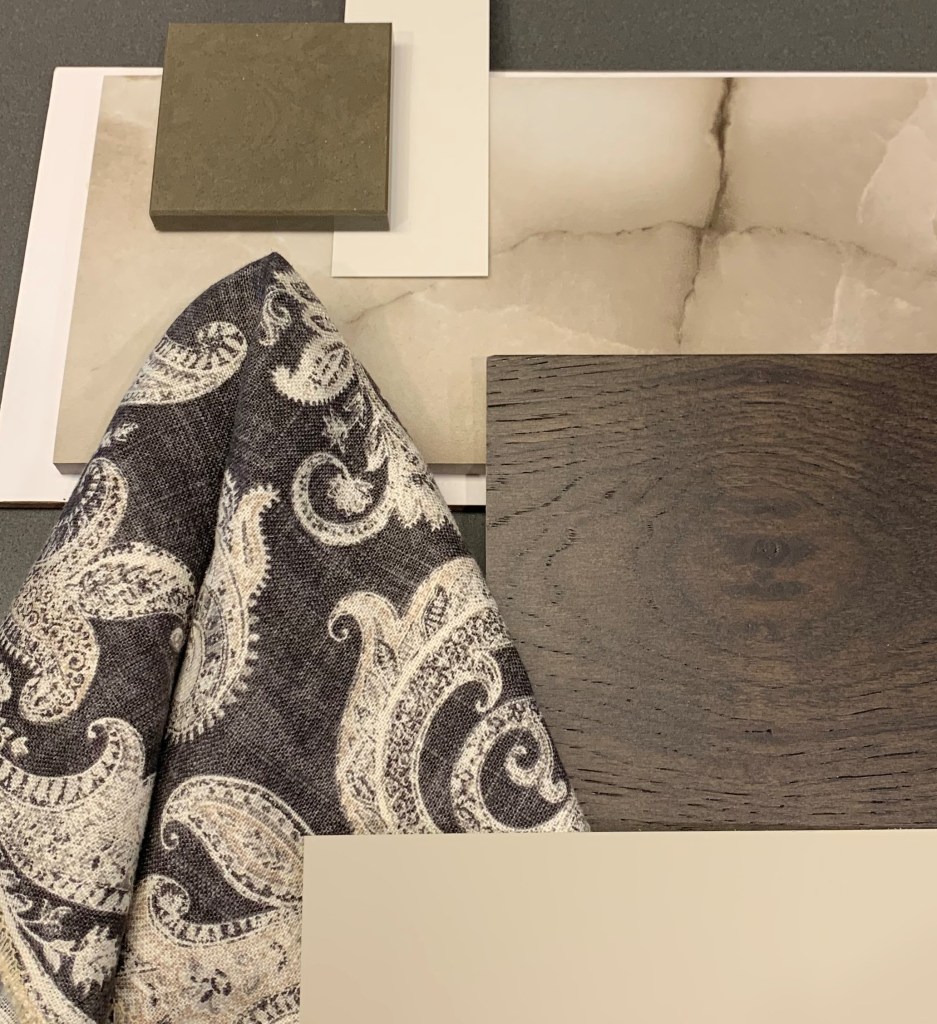
My inspiration started here:

And led me to this:

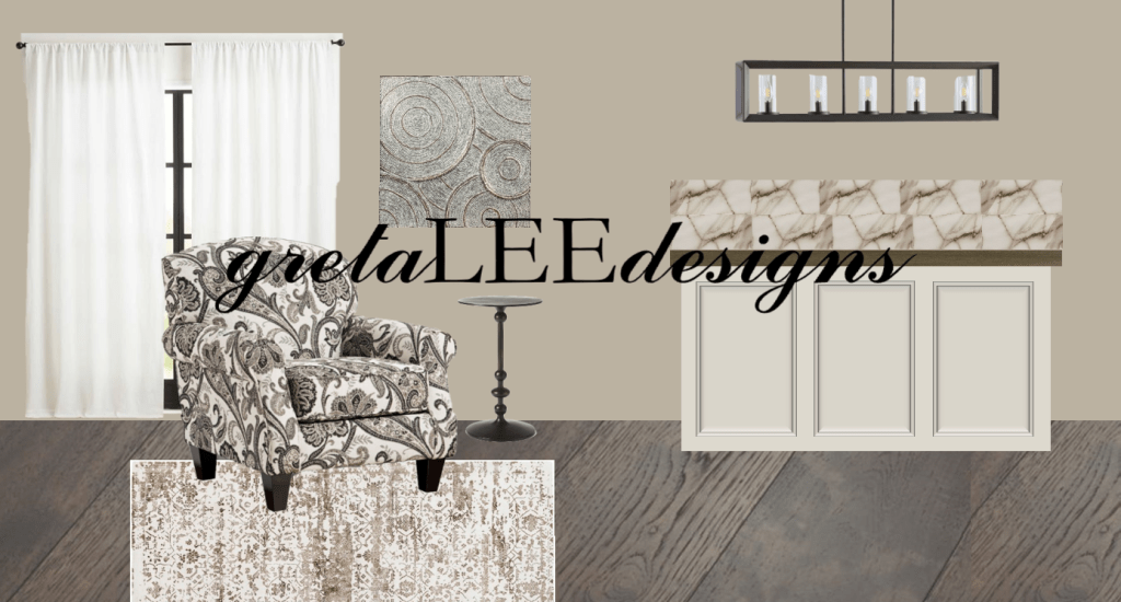
A warm, very traditional, with pops of patterns mixed along! I really started with the flooring and cabinet color. Mixed in a more neutral kitchen surface and backsplash to bring the pattern alive as the star of this room. Let me know what you think and if you’re wondering how else I would complete this look. A couch, pillows, bar stools, anything. I’ll have everything linked down below. Thanks for checking it out. XO, G

Benjamin Moore Pashmina Wall ColorBenjamin Moore Pale Oak Cabinet ColorCambria Quartz Surface CanongateAnderson Tuftex Imperial Pecan Umber FlooringWorld Fusion Abby Road Print ChairHome Depot Jonathon Y PendantTile Bar Lumina Black Onyx Porcelain TileBoutique Rugs HilldalePottery Barn Drapery InspirationWayfair Derrell Pedestal TableWayfair Dizzying Circles Wall Art

*Item pictures are not owned by me*

Blue Powder Bath

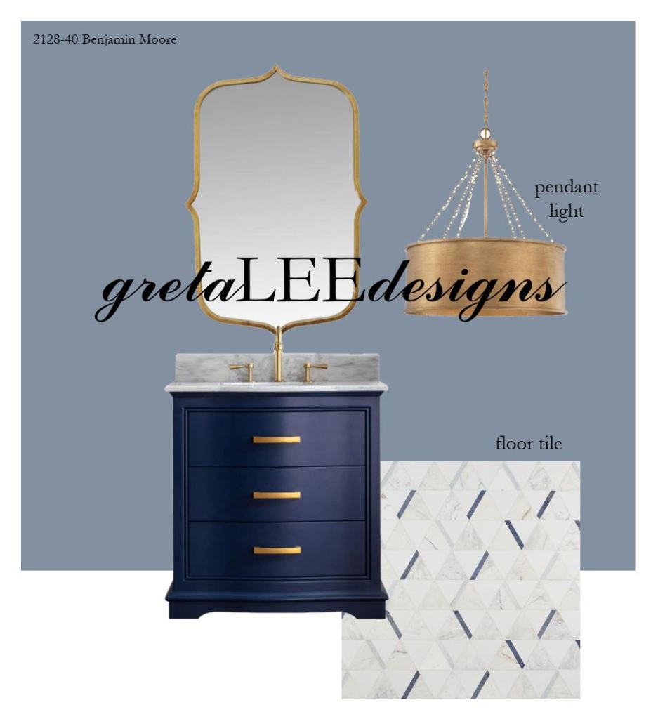
I was feeling inspired, so here’s the inspiration for you to enjoy too! I often think of how dramatic I can make a powder bath, and how that looks for different styles and colors. I designed an emerald green powder bath not so long ago, but lately I’ve been drawn to navy and gold. I was just scrolling through The Home Depot’s website when the vanity popped out at me and the rest fell into place. This powder bath has a more fun and transitional style to it than my first one. Let me know what you think! Links to every design element will be below.

Benjamin Moore Oxford Gray PaintStratton Antique Gold MirrorIllumine Meko Gold PendantMonroe Navy Blue VanityTile Bar Tres Azul Marble Mosaic Tile

*Not a sponsored post.